assets
Asset Details panel
A walkthrough of the right-side panel — gallery, lightbox, specs, tags, similar items, Request more like this, and the download area.
Updated 6 July 2026
When you click an asset card, the Asset Details panel opens on the right. It's where you get a closer look at the asset, see what's included, and start the download.
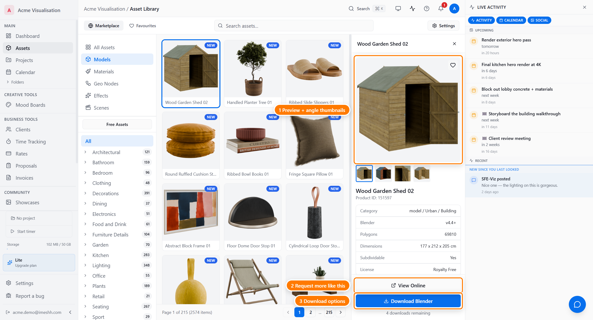
Opening and closing the panel
Click anywhere on an asset card in the grid. The panel takes over the right-hand side and shows, from top to bottom:
- A large preview image with a strip of thumbnails for the asset's other views
- The asset's name and product ID
- A spec sheet
- A Tags section
- A Similar items grid
- A Request more like this button
- The list of files you can download, with the Download button
Click the × in the top-right corner to close the panel. Clicking a different asset card swaps the panel to that asset.
The image gallery
The top section shows a large preview plus a strip of thumbnails below.
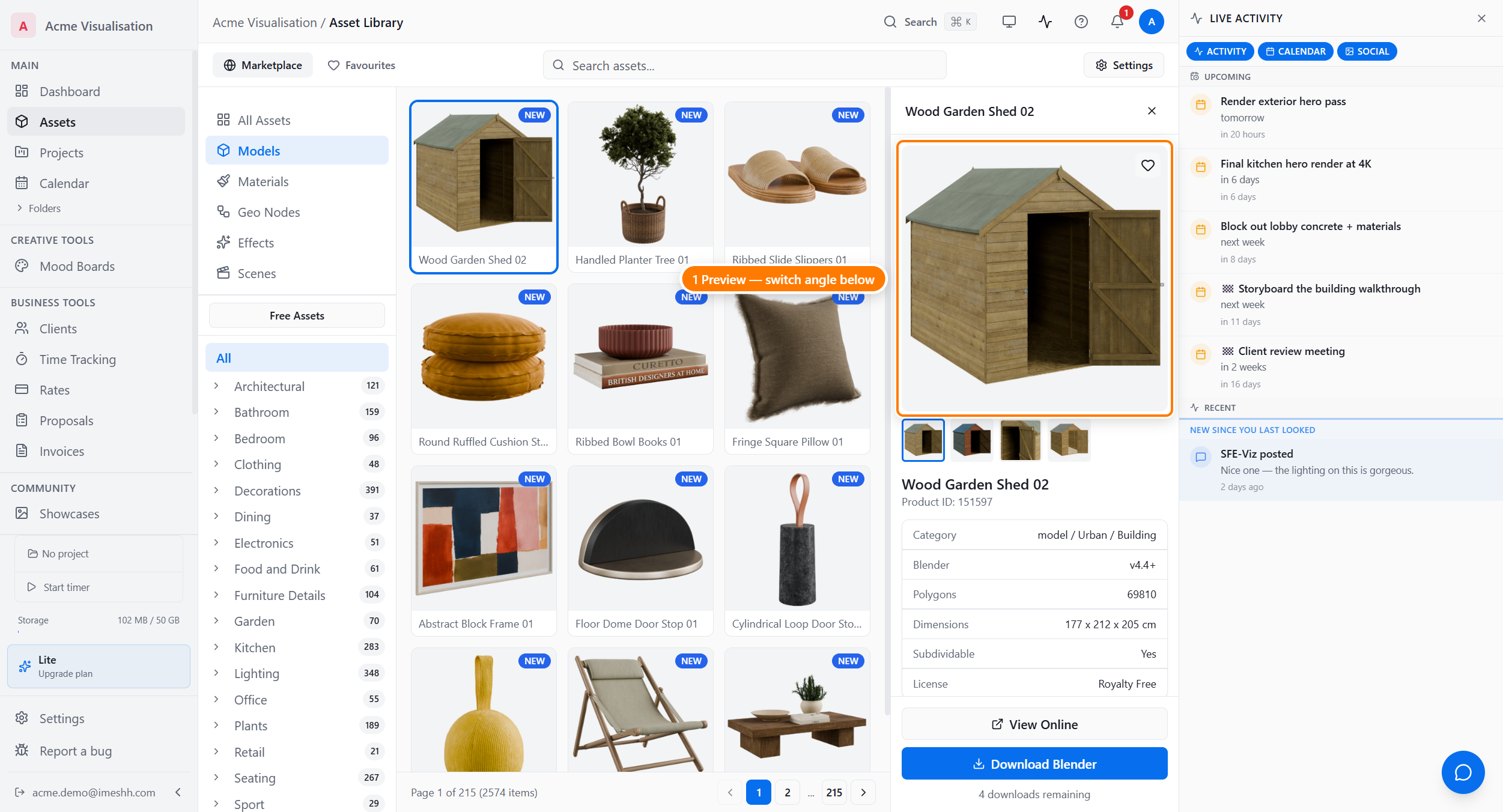
Click any thumbnail to swap the main preview to that view. For most assets you'll see:
- The standard render — the main image you see on the card
- A beauty shot — the high-quality marketing image
- A wireframe view that shows the geometry
Simple props might have only one or two views. To open any image at full size, point at the asset's card in the grid and click the Expand icon in the top-left corner — that opens the lightbox, where you can zoom and step through every image with the arrow keys.
Reading the spec sheet
Below the gallery you'll find the asset's name, product ID, and a set of labelled rows.

| Row | What it tells you |
|---|---|
| Category | Where the asset fits in the catalogue (e.g. model / Seating / Sofas) |
| Blender | The minimum Blender version that will open this file (e.g. v4.4+) |
| Polygons | The polygon count of the mesh — useful for scene budgeting |
| Dimensions | Real-world size in centimetres (length × depth × height) |
| Subdividable | Whether the model is set up for Blender's subdivision surface modifier |
Tags
Below the spec sheet, the Tags section groups the asset's tags by what they describe — type, material, colour, and style.
Click any tag to filter the whole grid by it. The tag is added to the active tag strip above the grid, and the panel closes so you can see the results. See Tag filters from an asset.
Similar items
Below the tags, Similar items shows up to six assets that share tags with the one you're viewing.
Click any similar item to open it in the same panel. Use this to walk from one asset to related ones without going back to search.
Asking iMeshh to make more like this
Below similar items is a Request more like this button.
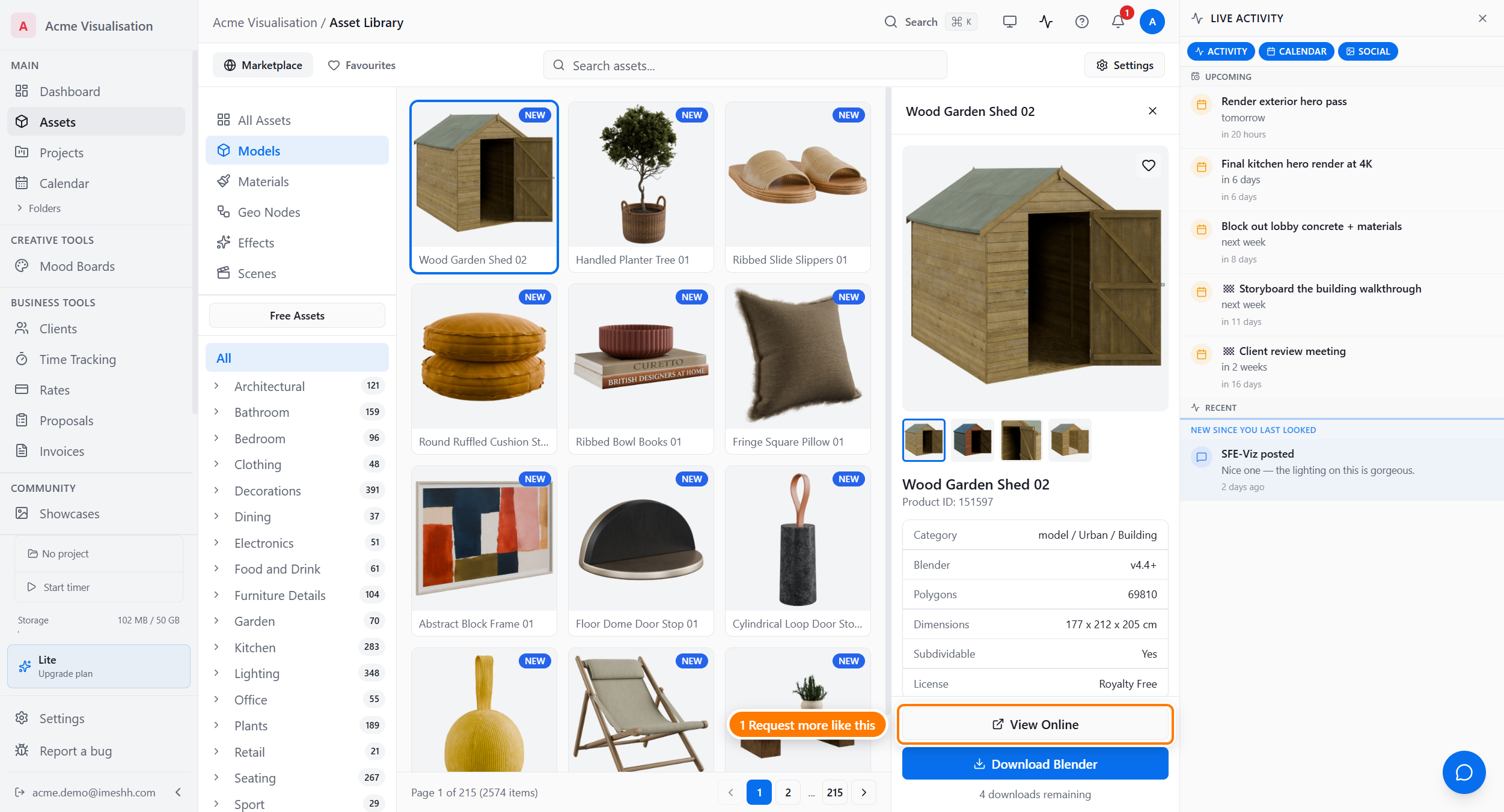
Click it once to record your vote. The iMeshh team uses these votes to decide what to model next. The button stays highlighted while your vote stands. Click it again to take the vote back. You can vote once per asset.
The download area
The bottom of the panel lists the files you can download and offers the Download button.
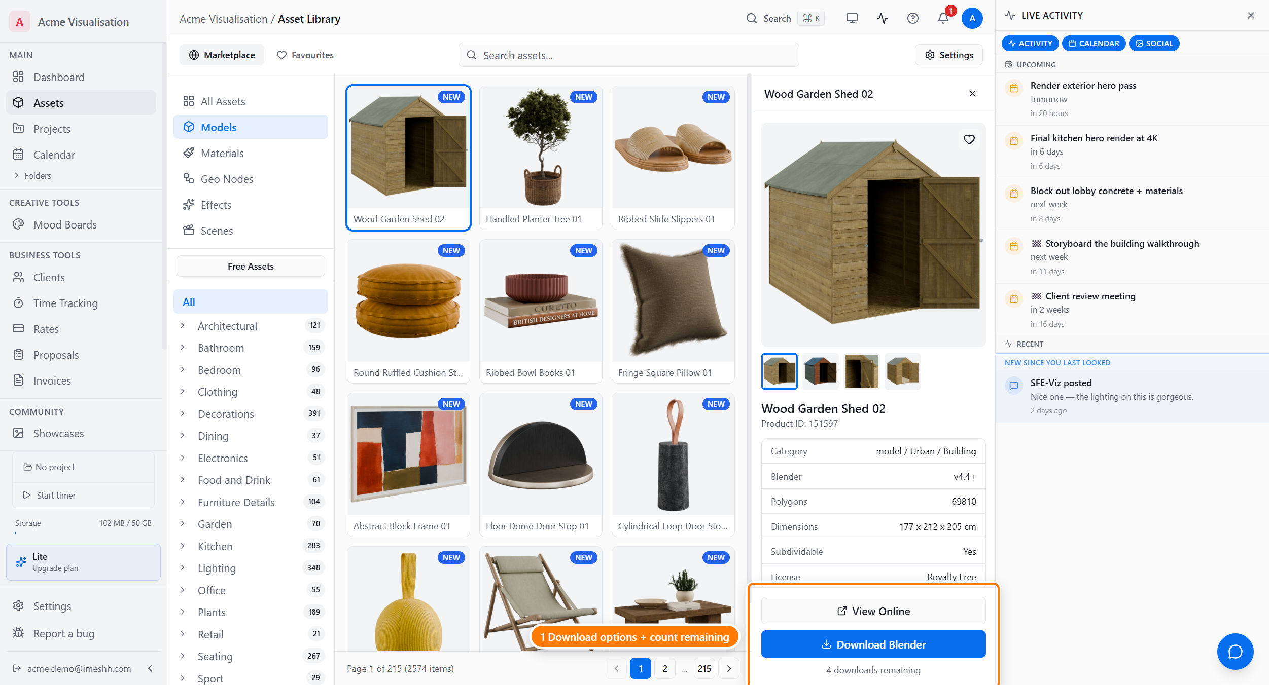
What you see here:
- Available Downloads lists every format iMeshh ships for this asset (for example, a Blender
.zipand a glTF.glb) - View Online opens the asset's product page on shop.imeshh.com
- Download starts the download for the selected format. When an asset has more than one format, the button shows a chevron — click it to pick a different format
- With glTF selected on an asset with an optimised export, 2K (web) and 1K (web) buttons appear under the main one — compressed tiers for real-time and browser work. See Optimised glTF and quality tiers
- The line below the button shows how many downloads you have left for this asset
On the desktop app, once an asset is downloaded, this area also shows Blender actions and a quality variant picker. See Downloading assets and Blender, folders & your own files.
What's next
- Favouriting & requests — saving assets to your Favourites tab and tracking votes you've cast
- Downloading assets — who can download, how often, and what happens when an asset is updated